A Super Short Summary
Before we begin the blog post officially…
I know some of you just want the quick, no fuss, one-sentence answer. So if you’re here for the short answer of what the difference between causation vs correlation is, here it is:
Correlation is a relationship between two variables; when one variable changes, the other variable also changes.
Causation is when there is a real-world explanation for why this is logically happening; it implies a cause and effect.
So: causation is correlation with a reason.
If you’re interested in reading the full explanation to properly understand the terms, the difference between them and learn from real-world examples, keep scrolling!
The days have passed where data was mainly used by researchers or accessible only to those with tremendous technical prowess. The times when getting data was a difficult ordeal that required months of manual tracking, survey design, or tracking code written from scratch are over.
Thank goodness.
In today’s age, with everything under the sun being tracked and cataloged, everyone has abundant access to data. However, this abundant access can act as a large barrier between companies that become great and companies that don’t.
People that know how to speak the language of data thus have a major advantage because they can wield this powerful tool.
Great marketers no longer come up with campaigns based on intuition; instead, they let their data tell them what campaign they should focus on, and then use their marketing expertise to build specifically that optimal campaign, identified through data.
Great product managers suggest product tests and changes based on extensive user research and product usage data.
Everyone can use data in their role, and it’s not very difficult to get access to data that’s relevant for you.
But often, the biggest hurdle is understanding: “With all this data, how do I know what’s actually important, what to focus my efforts on, and what steps to take?”
In this 2-part blog post, I’m going to show you how to go about answering those questions, and what it means to correctly use your data.
In this post, we’ll go over the basics, such as understanding what exactly correlation and causation actually are and taking a more detailed look at the properties of correlation, the different types, and the role that noise plays.
In the second blog post, we’ll go into the formulas for how to determine correlation strengths, how they can help us determine causation, and how to understand how important each variable is towards the final result.
What are Correlation and Causation?
The key to correctly using your data lies in understanding the difference between causation and correlation, so let’s look at each of those terms now.
What is Causation?
The essence of causation is about understanding cause and effect.
It’s things like:
- Rain clouds cause rain
- Exercise causes muscle growth
- Overeating causes weight gain

It suggests that because x happened, y then follows; there is a cause and an effect.

However, these are not particularly practical in a business setting.
When you’re going through your data in a practical setting, you’re basically looking for answers to questions, depending on your role, like the following:
- Which customer acquisition channel is the most successful, and why?
- Which parts of my product do my users love the most?
- Why are people buying my product/paying for my service?
And ultimately, what you want to be able to do is differentiate between the factors that actually did contribute to a more successful channel, the best part of the product, or the reason behind why customers are buying what you’re selling.
Here you’re looking for indicators that tell you which of your actions caused the desirable result.
Usually, this is never just one thing, but rather — a combination of many factors, each playing a role, in varying degrees, on the final outcome.
So, in practice, this can become very difficult because you often have a lot of things going on at once.
For example, if you’re in the marketing team and you see your newest blog post or video is driving a lot of web traffic to your site, you may wonder if this was actually due to your efforts or if it was due to:
- The new product addition that the product team launched last week, or
- The guest appearance your CEO made on a podcast, or
- The holidays being around the corner, or
- Someone posted a positive review of your product on a popular website,
- etc.
Or, if you want to be more precise, how much of that traffic increase was due to the piece of content you produced versus the other variable factors?
As you can imagine, attributing causation can become pretty difficult. Because these things can become so difficult in practice, you’ll often encounter a related, but more general concept, called correlation.
What is Correlation?
Correlation describes a relationship between two different variables that says: when one variable changes so does the other.
Dependent and Independent Variables
When you have a pair of correlated variables, one is called the dependent variable and the other is called the independent variable.
The value that the dependent variable takes on depends on the value that the independent variable has. You can think of the independent variable as the one that sets the scene, and the dependent variable has to respond accordingly.
For example, if you’re analyzing how many meals are made in your restaurant based on the number of customers, then the number of meals made is the dependent variable, and the number of customers is the independent variable.
With more customers, you need to make more meals, but if you just start making more meals, you’re probably not going to magically summon more customers to your restaurant.
Sometimes this relationship can become a little more foggy.
For example: if you’re analyzing the total time watched on your Youtube videos versus the number of views on the video.
In this case, the dependent variable is the watch time, and the independent variable is the number of views, since the watch time is a result of the number of views and how much each person watched.
Although you could estimate the number of views based on watch time, this relationship doesn’t make a lot of sense since a viewer first has to click on your video and start watching before they can contribute to the watch time.
Main Properties of Correlations
Correlations can be:
- Positive
- Negative (inversely correlated)
- Not correlated
Their correlation can be classified as either:
- Weak
- Strong
- Perfect
In the advanced blog post coming out next week, we will get into the statistical tests that you can do to determine the correlation strength, but here, we’ll first focus on getting a better understanding of what correlation actually means and looks like.
The following graphs show the types of correlations mentioned above:
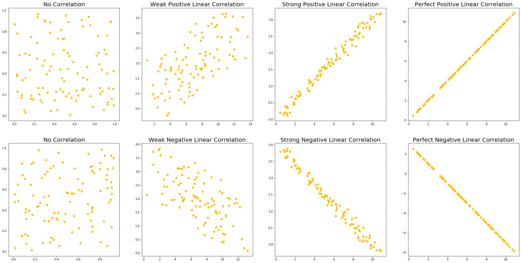
Across each column, we show first no correlation, then a weak correlation, a strong correlation, and a perfect correlation.
The first and second row shows a positive and negative linear correlation respectively.
- A positive correlation means that when one variable goes up, the other goes up.
- A negative correlation means that when one variable goes up, the other goes down.
As we can see, no correlation just shows no relationship at all: moving to the left or the right on the x-axis does not allow us to predict any change in the y-axis.
For example, there is no correlation between the weight of my cat and the price of a new computer; they have no relationship to each other whatsoever.
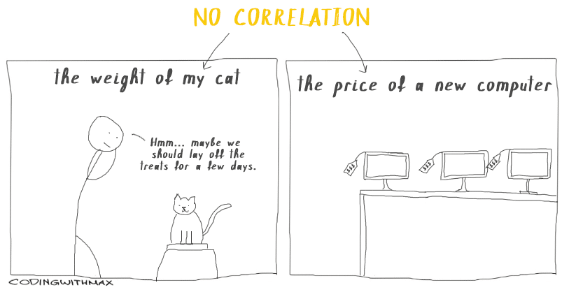
(If there were a positive correlation between my cat’s weight and the price of a new computer, we would all be in big trouble.)
A weak correlation means that we can see the positive or negative correlation trend when looking at the data from afar; however, this trend is very weak and may disappear when you focus in a specific area.
For example, let’s take the weak positive and weak negative linear correlation from above and zoom into the x region between 0 – 4.
This is what we may end up with:

And all of a sudden, that weak correlation we saw before is gone.
This shows us that although a weak correlation can tell us information about larger trends, these rules may not hold up when looking in a smaller region.
Therefore, when we have a weak correlation, we have to be careful that we don’t try to use it on too small of a scale.
A strong correlation means that we can zoom in much, much further until we have to worry about this relation not being true. If we take our strong positive and strong negative correlation from above, and we also zoom in to the x region between 0 – 4, we see the following:
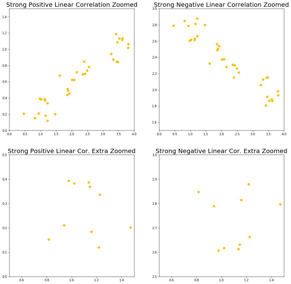
The top row shows us what the strong correlations look like when we zoom into the x between 0 – 4 region. As we can see, even here, the correlations are still very obvious, and they’re also still pretty strong (although not as much as before).
To get into the region where this correlation no longer holds, we have to zoom in pretty far, which is what we can see in the bottom row of the above graph.
Here, we zoomed into the region where x is between 0.5 – 1.5, which is 10% of our original range. At this scale, our correlations are no longer visible, even in a weak manner.
And lastly, a perfect correlation is correlation without any noise, and it doesn’t matter how far we zoom in, it will always remain perfect. This type of correlation isn’t really practical but it’s still important to know how the “ideal” correlation looks like.
Correlation Strength and Slope?
Another commonly misunderstood thing about correlations is that the correlation strength depends on the slope.
Take a look at the following graphs. All of them, except for one, show a strong correlation with the exact same strength.
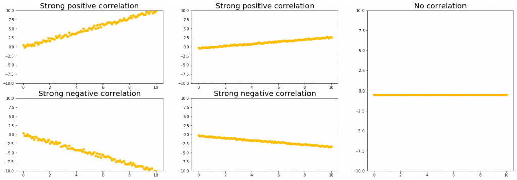
Notice how we can have a strong correlation regardless of if we have a large (left column) or small (middle column) slope.
The right-most column shows a graph with no correlation, despite there being essentially no noise. This is because of the way correlations are defined: how much a change in one variable affects the other variable.
In this case, the ‘y’ value doesn’t depend on the ‘x’ value, hence this is another example of no correlation (although a more realistic example of no correlation looks more like the random scatter of points that we saw in the visual in the previous section.)
What Noise is & Why it is Important for Measuring Correlations
You may have noticed that the middle column of the above graph looks more like a perfect correlation than the left-most column. This is because the correlation strengths depend on the scale of your noise relative to the slope.
So for the middle and left column to have the same correlation strength, the scale of the noise in the middle column has to be smaller than the scale of the noise in the left column, since the middle column has a smaller (shallower) slope.
The reason for this is something we’ll get into more in the advanced blog post coming out next week, so for now just know that you can have very strong correlations, even if your slope isn’t very large.
Let’s focus on just one term right now: noise.
So, what is noise?
Noise references the variation in your data. It exists because there are always many things affecting the data you’re looking at.
We’ve seen noise in our graphs above, especially when looking at the different correlation strengths.
Let’s pull that image up again:

In the left-most column, we can see a lot of noise; there’s a lot of variation in the data, and everything looks all over the place.
The second to the left column shows an overall trend, as we discussed above, but there’s still a lot of variation going on. We can see on our y-axis that the y values go from about 0 – 4, yet the width of our line is about 2.
In the third from the left column (the “Strong Positive/Negative Linear Correlation”), we see a much clearer trend. Our data still fluctuates a little, but not very much. In this case, we have little noise.
The right-most column has no fluctuations at all and shows a perfect, straight line with no noise.
So this is how noise “looks” like. We also only compared our noise to the y-values, but both x and y data points will have noise that affects them.
Let’s make this more practical though.
What is noise really, and where does it come from?
Let’s imagine you’ve made a smartphone game and you look at the amount of time each user spent on your game the first time they downloaded it.
The best way to visualize this would be in a histogram, which could look like this:

Normally, after you plot the data points that you do have, a distribution shape emerges and you can estimate the shape of the distribution based on the points that you do have.
The perfect distribution is what your distribution would look like if you had infinite amount of data points. This distribution can take on any shape; it does not have to be a normal distribution, like the one shown above.
The variation from a perfect distribution that we see in the histogram is another form of noise. Noise changes data points based on factors outside of the experiment’s control.
This noise comes from things like:
- A user starts your game and then forgets to turn it off, making them stay on longer
- Another user gets called down for dinner by his mom
- Another user’s game crashed so they weren’t able to play the first time

All of this introduces noise, which makes your data move away from the “perfect” shape that it would have if every user was just placed in an empty room and was asked to play your game until they don’t feel like it anymore.
So in all data analyses that you ever do, noise is something to keep in mind, and ideally, you would minimize the impact of noise in your data.
Controlling for Noise
Your data is always going to be affected by noise, but if you want to try to reduce the amount of noise in your data, you can try to control for some of the sources of noise.
For example, you could only look at your users whose app didn’t close because of an error, so that you control for the noise coming from user’s apps crashing.
For every variable of noise that you control for though, your sample size is going to go down, so if you try to control for too many things, you’ll end up with too few data points which won’t let you do anything useful either.
So what you want to do is identify your biggest sources of noise, i.e. which variables lead to the largest amount of fluctuation, and try to control for those.
In that way, you’ll keep your sample size as high as possible by controlling only for a few things, whilst still eliminating as much noise as possible.
Of course, finding the right balance between the amount of noise that is acceptable and the desired sample size is always specific depending on what you’re doing, so in the end, you’ll need to decide if the amount of noise you see in your graph is acceptable for you to analyze, and if the sample size is big enough.
There are some mathematical techniques you can use to help with this though, which is what we’ll get into in the advanced blog post for next week, if you’re curious.
Types of Correlation
Above, we saw examples of positive and negative linear combinations at different correlation strengths, but correlations don’t have to be linear.
They can also come in many different forms, such as linear, quadratic, exponential, logarithmic and basically any other function you can think of.
The following graphs show a few examples of correlated variables:

We can see in the left-most graph that when the ‘x’ value goes up, the ‘y’ value goes up a proportionate amount, and that amount is always the same.
The relationship between the x-axis and the y-axis can be described through the equation “y = mx + b”, which makes this type of correlation linear (this is also easy to see from the straight line on the graph).
In the middle graph, we see that depending on where we are in the graph, the ‘y’ value goes down (at x < ~ 3), doesn’t really change (at about x = 3), or goes up with x (at x > ~3).
At this point, it’s very important to point out that, although correlations don’t have to be linear, it’s standard to only look for linear correlations, because they are the simplest to look for and the easiest to test for with formulas.
Let’s take a look at some example correlations, such as:
- The hotter the weather, the more ice cream you sell
- The more upvotes your content gets on Reddit, the more page visitors you get from that post
- The more Instagram followers you have, the more sales you make in your business
To better understand these examples, I’ve visualized how the graphs for each of our examples above could look like.
Here is the number of ice cream customers plotted against temperature:

Here is page visitors plotted against Reddit upvotes:

And here is monthly business sales plotted against Instagram followers:

Notice how none of these have a real linear shape.
And actually – our ice cream sales seem to top off at about 200, page visits from Reddit votes seem to grow much faster after we pass 20 – 30 upvotes, and product sales seem to increase less quickly as we get into the thousands of Instagram followers.
So, to be more precise, we could say that the first graph looks like an “S” (aka sigmoid shape), the second graph looks slightly exponential or like a power relationship, and the third graph looks a bit logarithmic because it flattens out.
However, I still recommend that if it more or less looks linear then consider treating parts of it as linear for your analysis.
My point is: these correlations look close enough to linear that we can assume parts of them to be linear rather than treating them as more complex shapes that may be harder to evaluate and won’t lead to significant improvements to your findings.
Of course though, when the relation is too far from linear, you can’t assume it to just be linear.
So from the above graphs, we may come to the following conclusions when examining parts of them as linear correlations as part of the more complex shapes:
- With the ice cream graph, there is a specific temperature range where customer demand grows quickly (in the center) and the outer regions see little change in demand. Our ice-cream shop doesn’t need to plan down to the last ice-cream cone sold on a given day, but it would be very useful to know how many buckets of ice cream should be prepared generally, based on tomorrow’s weather forecast.
- With Reddit, we can then prepare our servers for increased traffic in case our post starts to trend, to make sure that our users don’t have too long load times on our site. With the graph, we can make educated estimates about the expected traffic and minimize risk of under- or overbuying.
- Or with our Instagram followers, we know what types of returns to expect at certain follower counts. But with the diminishing returns that we see in the graph above, we may want to think about strategies of how to make our current followers more loyal or engaged, rather than just trying to continuously get new followers.
What’s the Difference Between Causation vs Correlation?
So, the million-dollar question: what is the difference between causation and correlation?
Well, to put it shortly:
Correlation is a measure for how the dependent variable responds to the independent variable changing.
Correlation, in the end, is just a number that comes from a formula.
Causation is a special type of relationship between correlated variables that specifically says one variable changing causes the other to respond accordingly.
Causation adds real-world context and meaning to the correlation.
All causations are correlations, but not all correlations are causations.
You can have correlations appear between variables purely by chance, so when thinking about causation, we then have to ask ourselves:
- Does this correlation make sense? Is there an actual connection between these variables?
- Does/will the correlation hold if I look at some new data that I haven’t used in my current analysis?
- Is the relationship between these variables direct, or are they both a result of some other variable?
Examples of Correlation vs Causation
Here are a few quick examples of correlation vs. causation below.
Examples of correlation, NOT causation:
- “On days where I go running, I notice more cars on the road.“
- I, personally, am not CAUSING more cars to drive outside on the road when I go running. It’s just that because I go running outside, I see more cars than when I stay at home. This relationship is not cause-and-effect because neither the cars nor I are impacting each other.
Okay, what about an example that may seem more related at first glance:
- “On days when I drink coffee, I feel more productive.“
- I can feel more productive because of the caffeine, sure. But it can also be because I go to the coffee shop to drink coffee, and I am more productive at the coffee shop than at home when there are a million distractions. This cause-and-effect IS NOT confirmed.

Examples of causation:
- After I exercise, I feel physically exhausted.
- This is cause-and-effect because I’m purposefully pushing my body to physical exhaustion when doing exercise. The muscles I used to exercise are exhausted (effect) after I exercise (cause). This cause-and-effect IS confirmed.
- When I feed my cat more than 2 treats a day, my cat gets a little chubbier.
- My cat gets fatter because I am feeding it more. This is a cause and effect. Me feeding my cat treats is the cause and the effect is he becomes a little rounder.
Distinguishing between causation and correlation can be tricky when things are positively or negatively correlated for no reason or because of seemingly random, unconnected reasons.
Let’s pretend that every time I drink coffee, the price of corn in Spain goes up.
This would be a positive correlation: when I increase my coffee consumption, the corn price increases.
But does that magically make it a causal relationship? Nope.

Just because I drink more coffee does NOT mean that I am causing the prices of corn in Spain to increase.
There is no cause and effect relationship between me and corn prices.
Though… if by some strange, complex, global supply chain logistical reason involving my demand for coffee increasing coffee production in Spain which then somehow increases value in the neighboring cornfields thus actually increasing corn prices, and there was, IN FACT, a causal relationship… then that would be a different story.

But thankfully, there is probably no causal effect in this scenario, just a correlation.
These examples are a little more anecdotal for the purpose of establishing the difference between the two, but let’s look at a more practical scenario where the line between causation and correlation may be blurred.
For example, let’s consider two variables: 1) number of likes on a Youtube video and 2) the total watch time of the video.
We may see that as the number of likes on a video goes up, so does the total watch time of the video. Similarly, as the total watch time goes up, so does the number of likes.
The following image is a graph I’ve generated of the relationship between watch time and the number of likes for a select group of Youtube videos to help us visualize this relation:

Here, we see a weak positive correlation that’s not entirely linear, but that we will approximate to be linear for simplicity.
But what does this mean? And which direction does this correlation go? Which one is the dependent, and which is the independent variable?
Well, these variables could be loosely linked to each other:
- The more likes indicate that more people watched the video for longer because they liked it, or,
- that more people liked the video because they watched it for longer and enjoyed it.
Explanations in both directions make sense, but safe to say, neither of these is really causing one another.
A better causal variable that’s also correlated to both of these variables is the ‘number of views’ variable on the Youtube videos. Viewers are responsible for liking and watching videos, and hence, they cause these numbers to go up.
In this case, what may actually be happening is that the ‘number of views’ variable is CAUSING the higher watch time and likes on the videos. And the ‘watch time’ and ‘likes’ variables are correlations to each other only because of their casual relationship with the ‘number of views’ variable, but the ‘watch time’ and ‘likes’ variables themselves are not causally related to each other.
So as you can imagine, there are many cases where we can get correlations between variables that are directly due to a causal connection between the two.
Importantly, if you have a causal variable that’s correlated to several other variables, then these other variables could also be correlated to each other simply due to their dependence on the same causal variable.
This is what we saw in the example above.
So, in short, a correlation is a very important relationship between variables that may indicate a cause and effect relationships, but correlations themselves can sometimes be misleading or uninformative.
Unless we’ve assessed this relationship and have found actual meaning that connects the two variables, we shouldn’t start making decisions based on how we have found a correlated, but otherwise seemingly unrelated, variable to behave.